
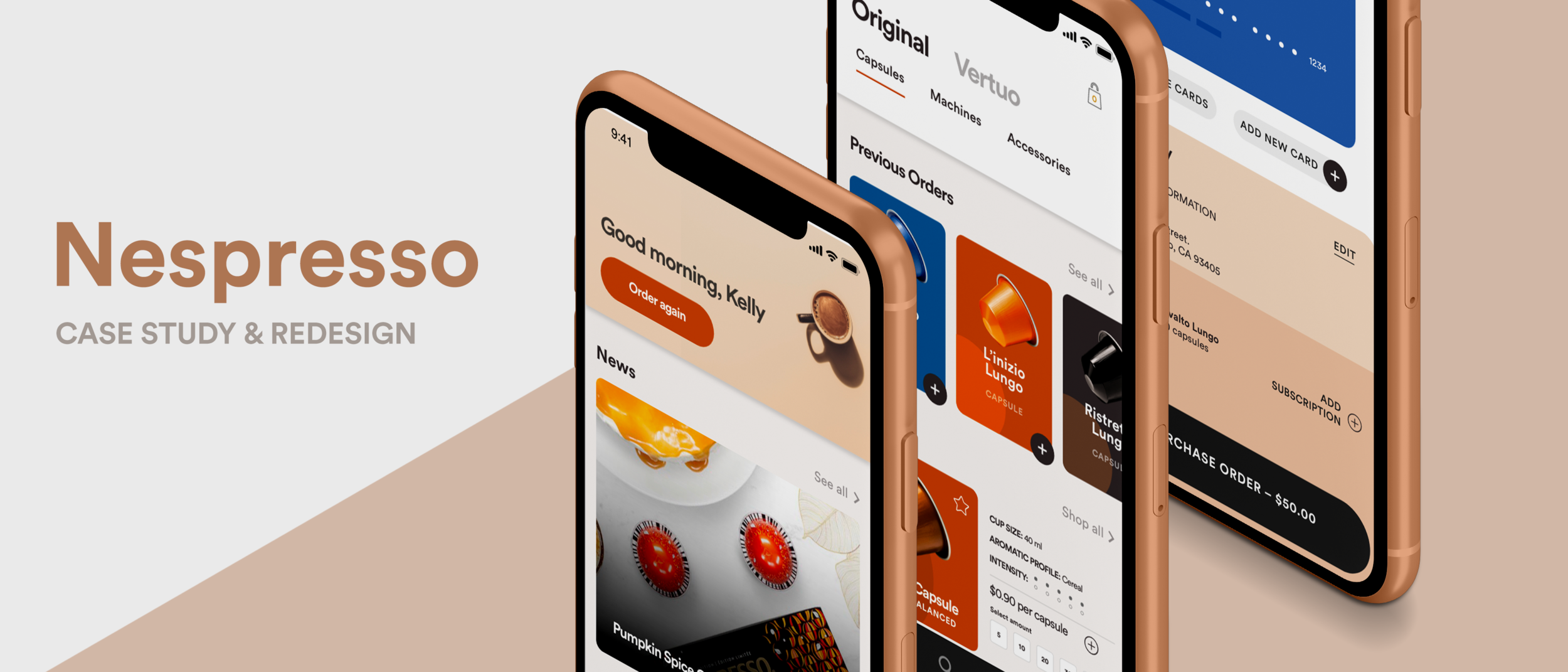
Nespresso Redesign
IMPROVING THE USER EXPERIENCE to increase revenue
ROLE: LEAD UI UX DESIGNER & RESEARCHER
DURATION: 3 WEEKS
TOOLS: ADOBE ILLUSTRATOR, ADOBE PHOTOSHOP, ADOBE XD
Objective
I chose to do a case study on Nespresso because it is a niche market with consumers that heavily rely on this brand to meet their needs. Nespresso pods, the coffee capsules required to insert into Nespresso machines, are exclusively available through online orders — they cannot be found in common grocery stores. This makes the online ordering process an extremely important aspect of Nespresso’s revenue. Without a seamless user experience, the less likely users will return.
IDENTIFYING USER NEEDS
Through this case study I discovered pain points in the original user flow. I identified these pain points through 5 user interviews, conducting usability tests to observe how each user completed a task. I gave each user a task scenario described below:
It is 8:30am and you notice that your supply of Nespresso pods is almost gone. Order more pods now so that it arrives before you run out.
From these interviews, I annotated the original Nespresso screens to highlight the main issues that the 5 users ran into while attempting to complete their goal.

Pain Points of Original Screens from Nespresso
CREATING A USER PERSONA
From these interviews, I developed a user persona to further understand the users’ needs. This helped me narrow my focus on what aspects of the original Nespresso screens needed priority for a redesign.

User Persona created through conducted user interviews
Competitor Analysis
I decided to expand my research with a competitors analysis to see the pain points in competitor products. I wanted to look at the competitive landscape with director competitors, such as Starbucks and Peet’s Coffee, to eliminate issues that other users run into. Factoring in these external reviews from different users gives me a fresh perspective on user expectations and needs from similar mobile applications.

Nespresso Competitor Analysis
Original & New Task Flows
I created this diagram to see how many steps it would take for the user to get to complete the task. Then I wanted to simplify it and reduce room for error by creating a new task flow. The goal of the new task flow is to better match the user’s mental model of shopping online while reducing friction for users to complete their goal.
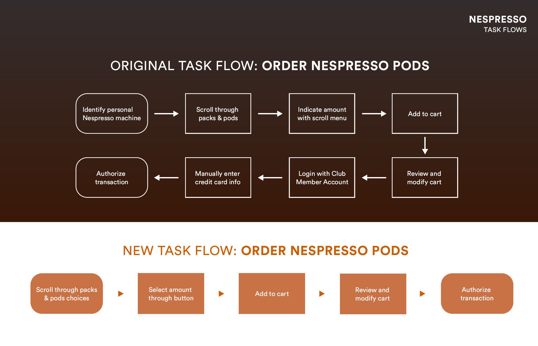
Original Flow vs. Simplified Flow
Final Screen Designs


KEY Takeaways
My Nespresso project allowed me to further develop my UI/UX researching skills. I realized that there is an abundance of resources online to teach me how to properly identify pain points and how to design a better solution for it. From this project, I was able to learn how to conduct user interviews and guerrilla usability testing, which made me a more empathetic designer that listens to user needs. If I had more time, I would validate my design solution with more user tests to ensure that the task can be completed without fail. This would require me to prototype my designs, which is an exciting project for me to take on in the future!